

Need to contact us quickly? Send us an email by
Clicking Here.

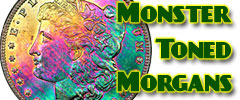
View the largest gallery of high-end and
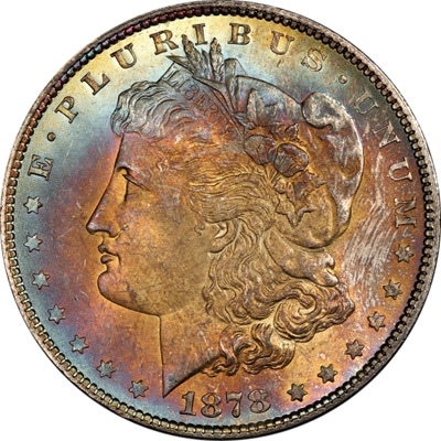
Monster rainbow toned Morgan dollars, an informational guide
on how to tell natural vs. artificial toning, learn to price
toned Morgans, view auction results of rainbow Morgans, and
view what characteristics to look for in high-end toned
rainbow Morgan dollars.


Lost? Find your way with the sitemap with links to all
the pages on this website. Sitemap

Here you can find interesting articles, videos, and
research tools for coins and currency. We are constantly
adding more links and articles to enlighten collectors.
Click Here

Click here for a how-to
guide for JhonECash.com. The site is very user friendly and
you may not even need to use this page but if you do, it's
right here waiting for you.

Click Here for answers to
ALL of your questions regarding Payment, Shipping,
How to Order, How to Use the Website, and More...


|
 |
What follows is a proposed new
classification system that uses this color progression to
describe the toning on our coins concisely.
I have listed and assigned classification codes to the
colors typically found along the thin film progression.
While in theory there are infinite gradations, and multiple
possible color cycles, in practice the eye distinguishes
certain colors, and after a few cycles the toning appears
violet, then black. So I have tweaked the list to include
the colors actually seen on heavily toned rainbow coins.
Here then is a list of color classes:
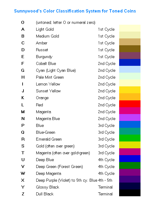
Notice that I have reserved the letter "O" (alternately the
numeral zero) for untoned. Otherwise I have used the whole
alphabet in order. (The zero can be used instead of letter O
in databases where we want to order the coins by toning
classification; with the zero, a simple alphbetic sort will
keep the untoned coins at the beginning of the list.)
The toning classification for one side of a coin will be
one, two or three letters. If the context requires
distinguishing between obverse and reverse, we can use an
optional period "." in front of the obverse classification,
and an optional slash "/" in front of the reverse
classification.
For an untoned obverse the code is .0; for the reverse, /0.
For a monochromatically toned obverse, "." followed by the
appropriate single letter; for the reverse, slash followed
by the appropriate single letter, such as /A for a coin
reverse toned light gold. The entire coin can then be
described as obverse class -slash - reverse class. So a coin
with a light gold obverse and untoned reverse would be A/0
This use of the slash is similar to the old style of
assigning split grades to the two sides of a coin, such as
63/65.
If the obverse or reverse covers two or more color
categories, use the lower toning limit, followed by the
upper toning limit. For example, a coin whose obverse runs
from untoned to cobalt blue would be 0F, light gold to
cobalt blue would be AF, and light blue or cyan to emerald
green would be GR. For the reverse, you can use the optional
slash preceding the classification: /AE, and so on. For the
entire coin, again the obverse, the slash, and then the
reverse: 0C/AD, AG/BF, and so on.
Sometimes the toning makes a jump to one of the last three
categories, typically after reaching at least emerald green
(category R). In that case I would append the X, Y, or Z
accordingly. So an obverse progressing all the way from
light blue to glossy black, showing all the intermediate
categories, would just be GY, but if it progresses from
light blue to emerald green and then jumps to glossy black,
it would be GRY. In this way, you could have classifications
such as AC/BRX, or ERZ/AR, and so on.
For most toners, we talk about one side or the other, and
most will fall into a two-letter classification, so we will
talk about a coin that is AE, or 0R, or GR, etc. This has
the consequence that some coins could receive toning
classifications that look like other numismatic descriptors,
such as AT, NT, PQ, AU, BU. That is why I'm suggesting using
the dot or slash in front of the two-letter classification.
Otherwise, you will have to make it clear in the context
that "AT" means a coin toned from light gold to magenta, and
not "artificially toned."
Here are some examples. I am using Morgan dollars here, but
this system can apply equally to all toned silver coins.
Thin film colors also appear on nickel and copper coins, and
even gold occasionally. On copper, some of the colors are
different because of the interaction with the reflected
color of the copper itself.
The classification system is interesting and fun to apply.
Here are a few examples of how this would work:
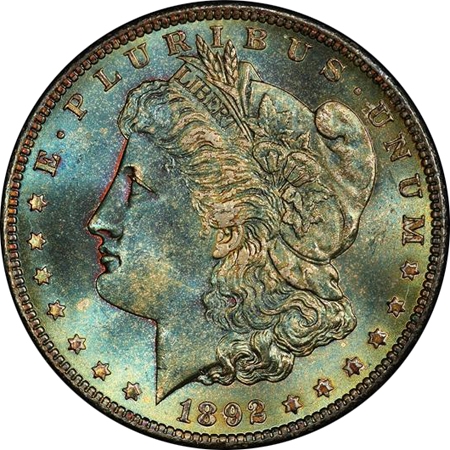
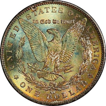
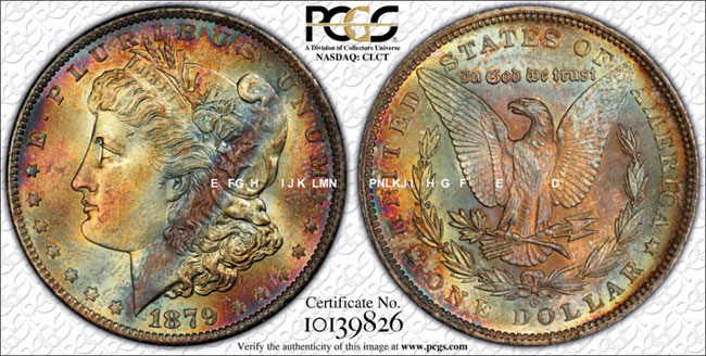
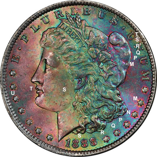
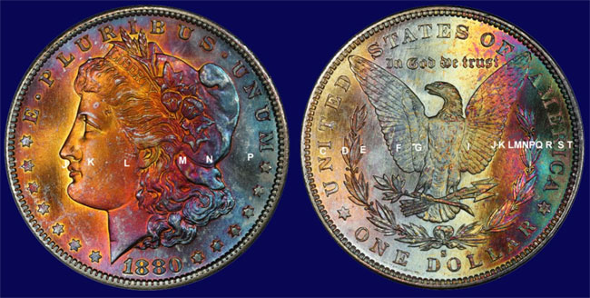
1892-CC PCGS MS66, obverse EH (burgundy in
the recesses of the portrait through pale mint green),
reverse FJ (cobalt blue through sunset yellow), whole coin
is therefore EH/FJ. Some might argue the reverse goes to
orange; that would be /FK. The toning classification can be
somewhat subjective, just like grading. Sometimes the colors
intermingle, and do not look like the corresponding colors
on my chart. For example, this 1892-CC PCGS MS66 Morgan has
an obverse that ranges from burgundy (E) in the recesses on
the left edge of Miss Liberty's portrait, through cobalt
blue and cyan, and into pale mint green with touches of
color out to sunset yellow. So it is in the range from E to
J. The reverse is a hair further along in the progression,
with scattered cobalt blue (F) ranging out to orange (K). So
the whole coin, both sides, falls in the range of E to K on
the chart. But if you look at the chart, you'll see that
it's a poor approximation of what the coin looks like.
Still, the chart is very useful, and allows you to put the
toning on this coin into the proper context.
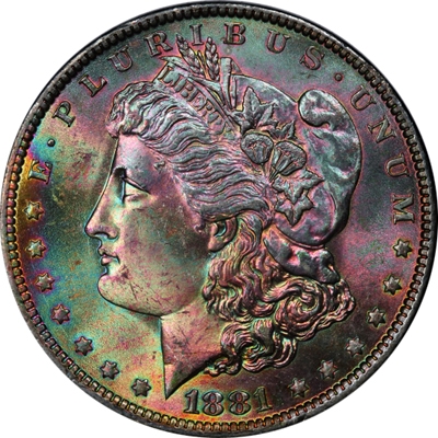
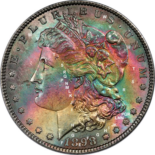
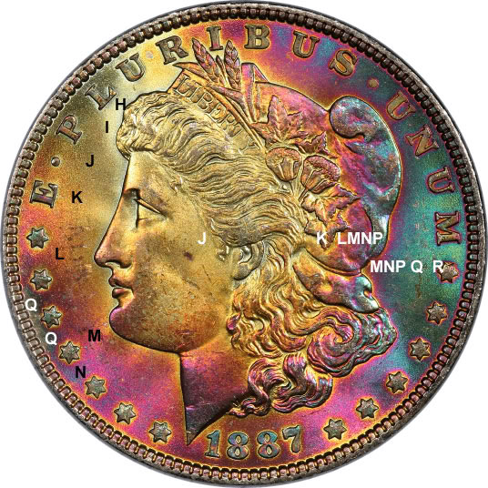
1881-O PCGS MS65, the "Purple People Eater,"
obverse ranges from sunset yellow at 9 o'clock to deep blue,
for example at BUS of PLURIBUS, classification JU.
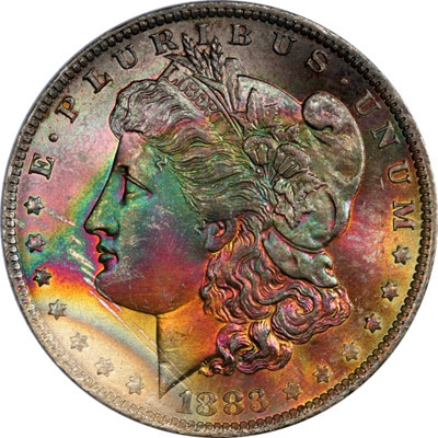
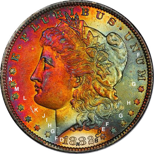
1883-O obverse from light gold at 7:30 thru
emerald green, gold, magenta, but then jumping to glossy
black, classification AMY
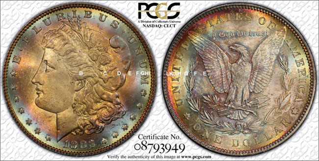
1878 7/8 TF Strong, obverse ranges from
medium gold around Miss Liberty's ear and hair, thru amber,
russet, burgundy, cobalt blue to cyan, but progresses
further at the top to pale mint green or lemon yellow. I
would call this BI (med. gold to lemon yellow).
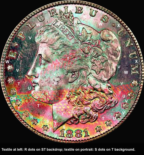
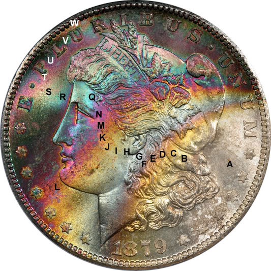
This is like "paint by numbers" in reverse;
you give me the painting, I fill in the numbers (ok, letters
in this case). For those who say this system can't be used
for a verbal description, here's my verbal description:
"A superb example of toning deep into the color progression,
this coin exhibits copious fourth cycle colors (deep forest
green and deep magenta) on the upper half, while vibrant
class T magenta dominates the lower half. Small amounts of
emerald green (class R) are seen between the digits of the
date, and at stars 2-3-4-5. The remainder of the green on
the coin is all forest green, class V. Textile in the left
field sports emerald green dots on a gold/magenta backdrop
(R dots/ST background), while on Miss Liberty's neck we see
vibrant 3rd cycle gold dots on a magenta backdrop (S dots/T
background). With toning ranging from class Q to class X,
this coin demonstrates that even deep into the progression,
we can have wild and vibrant colors on a classic bag-toned
Morgan dollar."
The colors can be a little subjective, and
the gradations are infinite, so just as two people can
disagree on whether a coin is 63 or 64, there might be
disagreement whether to call a particular color medium gold
or amber ... so what I classify as BI might conceivably be
called CI by someone else. But even though nothing is
absolute, the classification still tells you a lot about the
coin.
Note that artifically toned coins can still obey the
standard progression, and there are also some naturally
toned coins that do not. This can happen if there are
unusual contaminants present during storage, perhaps such as
chlorine, or excess sulfur. Such coins may fit our generally
accepted notions of natural toning, while still exhibiting
some unusual colors. But the vast majority of toned silver
coins will conform to the standard progression.
Here are some examples color mapped:
Arguments and Rebuttals:
<< so basically you have
taken a color chart of thin film interference,
slapped some letters on it an key points, and consider it
part of a
classification system for toned coins? >>
Yes, that's quite right. It gives us a convenient system of
reference and nomenclature. And it's an extremely useful
tool for anyone who collects and studies toned coins, and is
interested in the science and the chemistry. It beats just
saying, "Ooh look at the pretty colors" without knowing what
they are and where they come from. And I don't believe
anyone has applied this quite so directly and clearly to
colorful toning. (By the way, what would you have said to
Sheldon?)
<< Then arbitrarily choose which colors
represent a cycle based on where
blue seems to repeat instead of say gold/yellow which
clearly starts off
the chart and repeats too? >>
Not aribtrary at all. This follows the conventions used in
thin film coatings for optics. Because blue is the shortest
of the cone receptor-specific wavelengths at 220 nm, the
oscillation between cancelling and reinforcing blue light
occurs more frequently than the other primary colors.
Therefore, it is the constructive-destructive interference
for blue that is used to mark the cycles. The reason that
toning starts with golds is that those colors represent
cancellation of blue light, which occurs first since it is
the shortest wavelength.
<< then to call this the sunnywood
classification system instead of Physics 101
that freshman take in college? >>
Yes, I enjoy putting my name on my work, wouldn't you? There
is nothing new about the thin film interference color
progression, but I don't think anyone has gone quite as far
in applying it to the colorful toning on coins. I don't
think college freshmen study rainbow-toned Morgan dollars.
At least I didn't when I took Physics 55 freshman year at
Harvard. I'll be happy to support your creative
contributions under your name, when you make them.
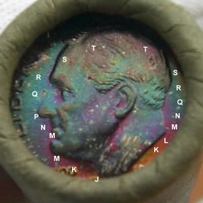
<< What about darkly and
evenly toned small diameter silver coins? >>
In small diameter coins, especially those
that have been in albums, tend to get covered more quickly
with toning as it encroaches from the perimeter, and
therefore often fall deeper into the progression, with
colors that cover the entire surface. A larger coin, stored
under the same conditions, would likely have more
differentiated target toning. When trying to classify a
color, it helps to look at the hints of other colors nearby,
for example in the recesses of the devices. In this case,
while it's always hard to be certain from an image, it
appears that the predominant color is class R, which I call
"emerald green" (although in this case, it appears darker
than on some of the Morgans I used to demonstrate above).
There are subtle hints of the colors that come both before
and after class R, if you study the coin carefully.
<<I am not a collector of toned coins, but
I do find this post very interesting. I’m in the
semiconductor industry where film thickness is measured on
silicon wafers. It's done by correlating film thickness to
the surface color of the silicon when lit by different color
lights. If I understand what you are saying, you're pretty
much doing the same thing.
I'm curious what a map of the film thickness of one of your
coins would look like (after removing the coin details and
just plotting the thickness as indicated by color). Here's
one of some silicon.
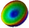
Since the order of letters
(classifications) you put over the coins indicate a smooth
transition in thickness, I'm guessing the film thickness map
would look smooth as well. It might emphasize how a very
small and smooth transition in film thickness can cause a
drastic change in color (seen in your color chart but not as
easy to visualize when looking at the coin). What's the
value to it? I have no idea. I suppose you could predict
what a coin will look like if the film continues to thicken.
Or maybe the film growth patterns would indicate something
(leak in the slab, or help to ID doctored coins?).>>
the color distribution on the coin's surface is essentially
equivalent to a film thickness map. The way the colors do
generally flow smoothly along the progression shows that it
is a continuous, well-formed surface. Of course the slope
can vary, so you can have steep areas where the color
changes rapidly. The incoming light, along with our own
eyes' ability to process it as perceived color, is
equivalent to having a film measurement device that outputs
a color-coded map.
<<Forgive me if I missed this in your
initial post on this topic, but the one
potential downside I see to this is--just like the TPG's--it
seems subjective based
on one's interpretation of color.
For your system to become more widely used, how do we
eliminate, or at least
diminish, the inherent subjective nature of viewing
colors?>>
This is not really subjective in theory, as there is a
specific film thickness that is theoretically measurable.
But, in practice, it can be a little difficult. I have some
coins that display, for example, magenta to blue to green,
where I'm not sure whether it's EFGH color, or MNPQR color,
or TUV color. Usually I can tell, but there are some rare
exceptions. In theory, it could be measured though, to get
the correct answer - as every color class on my chart
corresponds to a specific range of toning layer thickness.
Also, there are some chemical environments that can alter
the color scheme somewhat, for example by introducing
molecules into the toning layer other than the usual amounts
of oxides and sulfides. So for example if there was chlorine
around, some of the colors might look different. Therefore,
the historical packaging for certain series (e.g.
cellophane) will result some different "looks" to the coins.
In addition, if the substrate metal is gold or copper, which
have their own "color" (i.e. they absorb certain wavelengths
of visible light on their own), then the progression may
look different on those metals. Surface quality and finish
can also affect how vivid the colors look. So there are
variables. But for now, by sticking primarily to album-toned
silver and rainbow bag-toned Morgans, I am finding that the
color chart is quite universal in its applicability.
<<Sunnywood, this discussion and the
science involved may not be new but the application of it is
what's valuable in the long run.
You are taking the question another step and it is much
appreciated that you are doing this. It's not that someone
else couldn't have done this - it's that no one else has
taken the time and effort to do so.
Since my own time is limited by other constraints, it's nice
to see a field being developed for everyone's future benefit
and future reference.
As to the lettering system, it's a tagging system that helps
map out the coin images in order to make better sense of
what is in front of you. Great idea! How else would one do
it - microscopic notes overlaid on the image? NOT.
Since you are giving this much more thought than most, I'll
ask you the question - do you think that AT can be
identified by the toning characteristics?
2nd Question, would you map these two for me? (See Below for
mapping)>>
Small diameter coins can be a challenge, as
there isn't enough room to have easily differentiable
colors, and they tend to get more heavily toned in albums
than their larger counterparts, as the peripheral rim toning
reaches the center faster. But these two are easy:
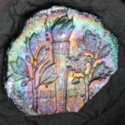
Moderns, especially those that were in the
cellophane Mint set packaging, can get very vivid colors,
and that can make it very difficult to determine which cycle
you're in. On some moderns, the earlier cycle colors EFGH
can be so vivid that they resemble later colors like MNPR. I
have much more experience with Morgans and 19th century
album-toned type, so I need to study more Washies and
Frankies to understand the modern colors better. Here's an
example of a detail from a 1957-D quarter, right-facing
wing, that illustrates the problem (using your "microscopic
notes" idea !!):
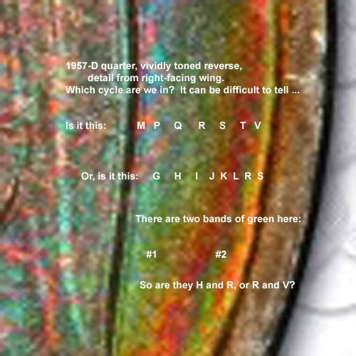
The answer, I think it is H and R, because
to the right of band #2 we have a light gold, probably class
S, which I wouldn't expect to see quite so clearly after
class V.)
Here's the whole coin, with my best guess as to what's
actually happening:
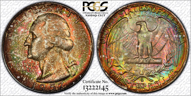
The rim toning on the reverse is least at
about 2 o'clock, where it only gets out to K or L (red), but
as you go down the right rim, you see that thin red band
move in from the edge. Down at DOLLAR it runs through the
middle of the letters. Over on the left side, at U of
UNITED, it is at the bottom of the U. Beyond the red band,
you see a thin band of green (R), an then another red band
(T). The bands are too narrow to label them all properly on
the image.
Until I learn more and gain more experience, I am most
comfortable on Morgans (because I have seen thousands of
them), and less comfortable on moderns (because I have never
collected toned moderns). Perhaps the worst series in terms
of toning on silver is Peace dollars, due to some aspects of
their manufacture.
Article by: Doug Kurz (dkurz@mindspring.com)
Compiled and Edited by Brandon Kelley (brandon@jhonecash.com)
Edited and reprinted here from Doug Kurz's
Article on the PCGS message boards with the permission of
Doug Kurz.
|